


.jpg?1765802429884)


.png)
BI Report: Deal Analytics
Deal Intelligence Dashboard
-
Điểm
-
Cài đặt21
-
Nhà phát triển
This BI report is developed based on the standard data source crm_deal (deals table). It includes necessary measures (dimensions) as well as some calculated columns.
Optim24 BI reports are an optimized dataset with highly informative visualizations.
When you install the application on your Bitrix24, the following report elements are created:
Dashboard: Deal Analytics [optimpro] (includes 6 cross-cutting filters)
Dataset: optimpro.deal_analytics (contains 22 standard columns and 10 measures for calculations)
Charts: 28 unique charts (6 types)
All report elements have clear names and detailed descriptions, making it easy for you to customize our report for your needs without any special effort or complexity.
The essence of the report and its appearance are well illustrated in the application screenshots – please take a look at them.
Next, we will describe the report’s structure in more detail.
Report FilteringOn the left, in the filter panel, the most relevant data filtering fields are displayed:
Time period – allows you to select any desired time interval. This filter applies to the "Creation Date" field.
Units of time – allows you to select a time interval for grouping data in charts (where supported).
Assigned – allows you to select a company employee (multiple selection). This filter applies to the "Assigned By" field.
Category – allows you to select the CRM pipeline to which the deal belongs (multiple selection). This filter applies to the "Direction" field.
Status – allows you to select a deal status group (multiple selection). Supported values: In Progress, Failed, Success. This filter applies to the "Deal Status" field.
Source – allows you to select a deal source (multiple selection). This filter applies to the "Source" field.
When hovering over a filter field, the report charts affected by it are highlighted in blue. By default, all charts in our report are linked to the filters, allowing you to create highly flexible filtering conditions and, consequently, fully personalized reports.
Report (Dashboard)After applying filters, the entire report automatically updates to display data with the selected filters.
Report ChartsSome charts allow additional filtering when clicking on the chart element’s name.
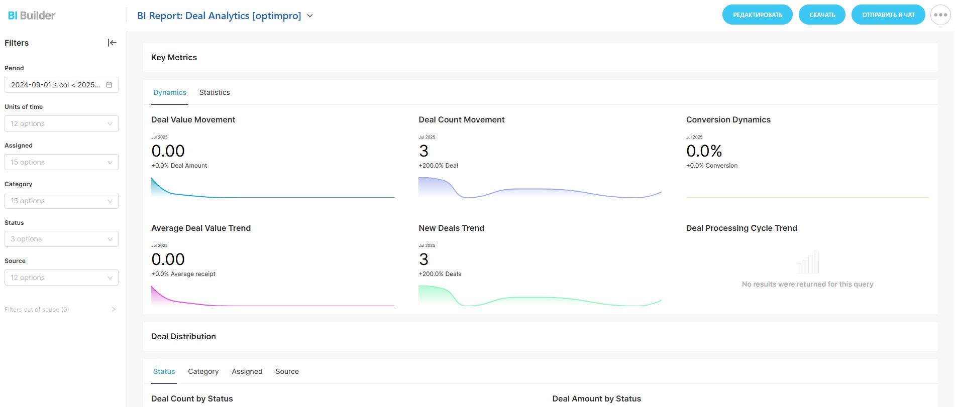
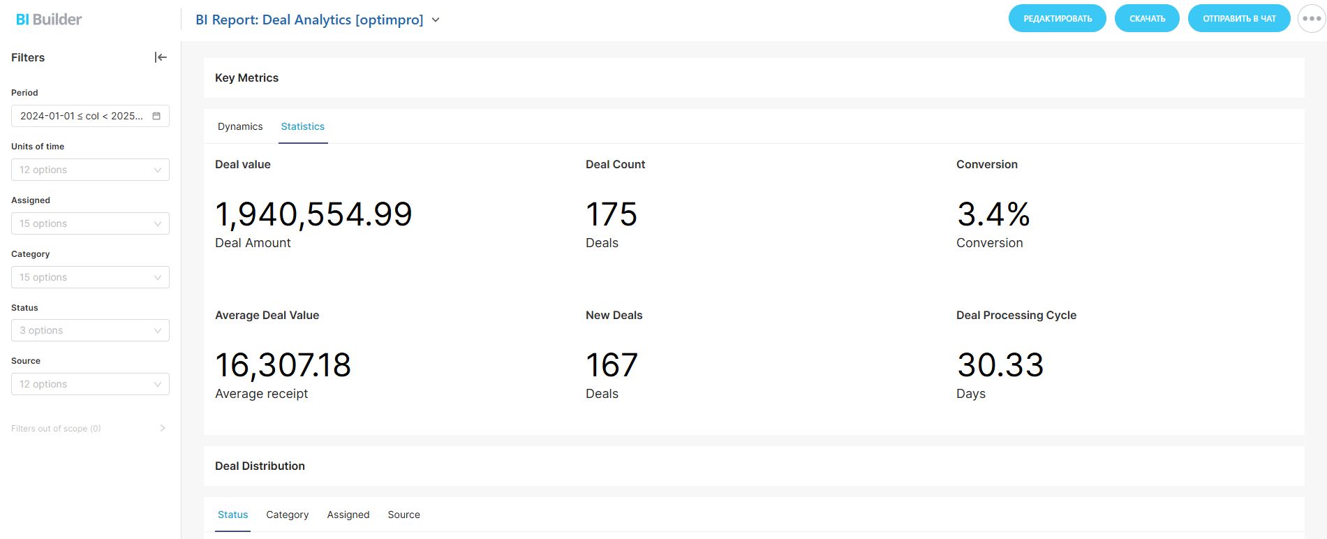
⭐ Tile (Dynamic Metrics)Calculates key deal metrics and shows changes in dynamics compared to the previous period:
Deal value
Deal count
Conversion
Average Deal Value
New Deals
Deal Processing Cycle
Calculates key deal metrics:
Deal Value
Deal Count
Conversion rate
Average Deal Value
New deals
Processing cycle
You can hide unnecessary charts by clicking on their names in the legend.
You can also zoom in on a chart by adjusting its time period in the element below the chart.
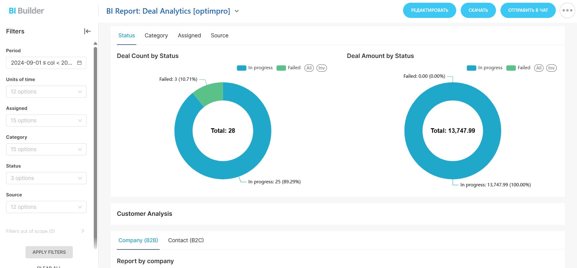
Displays the number of deals by status, category, assigned, and source as a percentage on a diagram.
You can hide unnecessary values by clicking on their names in the legend – the data will update automatically.
Displays the deal amount by status, category, assigned, and source as a percentage on a diagram.
You can hide unnecessary values by clicking on their names in the legend – the data will update automatically.
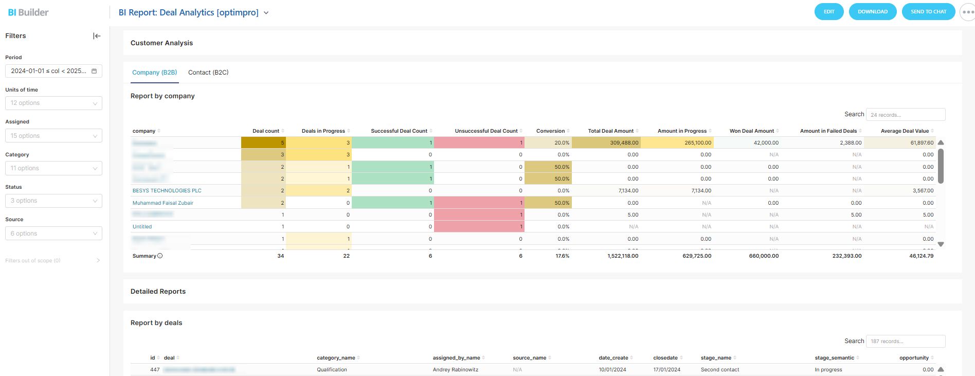
Displays an informative table report for companies/contacts/sources, containing the following details:
Company name
Contact name
Deal Count by Status
Deal amount
Average deal value
Conversion rate
Additional features include sorting by any column, quick search, and pagination.
⭐ Detailed ReportsDisplays a detailed table of deals with links to each.
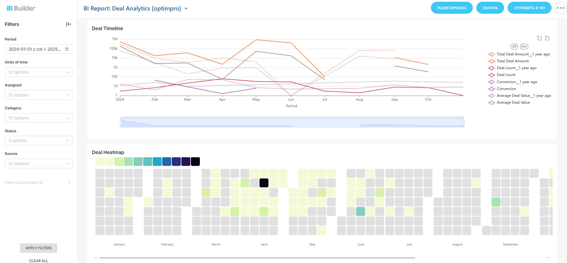
Shows a comparative chart relative to the previous year by the number of deals, amount, conversion rate, and average deal value.
Displays the number of deals on a calendar heatmap. The legend indicates which color corresponds to which number of deals. Hovering over a specific day shows the number of deals created on that day.
.jpg)